Wednesday, September 8, 2010

Diagraming Dubai


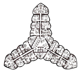
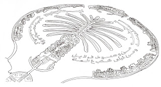
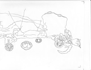
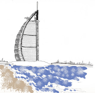
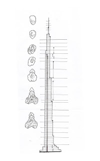
For this assignment we had to compose a series of diagrams on a certain architectural building we personally chose. My decision to choose the man-made islands of Dubai was a risky one, but I find their design appealing, their concept, fascinating. It was a challenge, however, to find the architectural documentation that was required for the assignment. I found aerial images of the islands themselves, along with plan views of the Burj hotel, which is the tallest building in the world as of now. I was also able to find a floor plan of one of the levels in the hotel. I wasn't too pleased with my overall diagram that I was able to put together, but here are the traced images and one free-hand sketch that I used for the final result.

Summer Passion


One of my passions is art. Sketching favorite actors and artists, or simply sketching what's in my mind at the time. It helps deal with emotion and express my "free spirit gypsy soul" (as some people like to describe me :D). This summer was a summer of James Dean. He, along with others such as Johnny Depp and Robert Downey Jr, inspire me greatly. I also choose to emulate other various images I found. I deeply enjoyed sketching this summer and was very pleased with the results.

Sunday, May 2, 2010

Reflection for Final Project

For our final project, we were assigned to design a space for a client (designer, artist, etc) of our choice. The space could either be from the loading dock or the administrative office. I chose film director Joe Wright and designed using the administrative space. His style of film is actually what inspired me to design his space the way I did. He uses a lot of rich colors and movement in his films, which is what influenced my title ‘Literary Movement’. We had to include various architectural elements on our board. For example, floor plan, elevations, perspectives, etc. We were also asked to include one level change in the space and design a studio and living area. I decided to keep make the studio space the focal point, having your eyes move directly towards it when entering the space. I did this by adding a brick wall with double French doors leading into his studio. I also added architectural wood paneling along the ceiling, directing your eye towards the space. The color palette I chose was complementary, using rich green, red, brown, and yellow. As for my actual project, I felt that my board and presentation went ‘okay’. The critique I received was very helpful and I am now more aware of what to improve on in the future. I know personally that I could have done much better in my perspective drawings. This was frustrating for me because I know what I am capable of doing, drawing-wise, and feel that I did not meet my personal expectations. My drawings were rather confusing for the audience and I felt, did not help get my design across the way I would have hoped. For any future assignment, I would make sure to draw my perspectives with my audience in mind. I felt my floor plan and elevations were done nicely, but they can always be improved, be cleaner, neater. Overall, if I could re-due this assignment, I would definitely make improvements with my perspectives.
Thursday, April 29, 2010

Clue #7


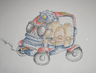
Here is my final rendered car. I adapted pointillism style using colored pencil.

Tuesday, April 27, 2010

Clue #5


For this assignment, we had to draw a car in a 2 point perspective, without any value or rendering. I chose a Campus Security Car I see around campus. The back wheel looks a lil off. =/

Monday, April 26, 2010

Clue #1


For this assignment, we had to choose two spaces on campus that had special meaning to us. I chose a space by the fountain and a space by the park by the Foust Building. Both spots are both place I visit regularly to either draw, socialize, or simply relax.

Thursday, April 8, 2010

Extra Credit


One spot on campus that I really enjoy is the fountain. Not only is it exciting, it can be relaxing as well. I love simply sitting out with friends, enjoying the weather. Recently, I have been going there to draw. I've drawn a few perspectives from various spots around the fountain. I chose this perspective sketch because it incorporates depth and texture. I wanted to capture activity in my sketch through my use of scale figures and the different waterfalls.

Sunday, March 14, 2010

My Emulated Sketches


Various Inspiring Artists


Inspiring Artists


At first, I read the assignment wrong and only choose one artist to emulate. Here are the 3 of the 5 sketches I did in the beginning. I altered two of them to match other styles.

Thursday, February 18, 2010

Window

For this assignment, we had to create two moments of light in a selected window using cardboard and two other materials (optional) of your choice. We were also asked to collaborate with our neighboring windows and their design ideas. After doing some research, I decided that for my design, I wanted to focus on the layering of cardboard and how that would create two moments of light. The two moments of light I created are the light reflected in between the two layers of cardboard and the shadow cast as well. I am overall very please with the outcome of my project. The only critique I have on myself would be the improvement of craft. If I had more time, I would redo the exterior layer, making sure the slits were even and smooth. I would also do a better job of measuring both layers in relation to the window.


Various images taken around 10am...


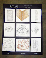
Ritual... Final Images

For this assignment, we were asked to create a ritual for a certain object, and make it out of wood and one other material (of your choice). My ritual was wearing and/or protecting my grandmother's ring. My first model was of a hand made out of clay cupped upwards, with a stand for the ring to sit on the palm of the hand. This hand was then placed on a wooden tray. It was suggested that I change this however, because there were not two separate objects, two separate steps, in a sense. I then decided to create another hand out of clay, this one cupped down. This way, you have to pick up the hand in order to get the ring. This also adds to the protecting aspect of my ritual. Overall, I feel that the craft of my project could have been improved.

Here are some images of my final model...

Wednesday, February 3, 2010

Morning Exercise 2-2-10


For this morning assignment, we all went to the lobby where the had various shelter-type structures designed and displayed. We were asked to draw what we saw. There were various structures, which is why I chose the angle I drew from, because I was then able to draw work on perspective. I am very pleased with how my drawing turned out, especially because I did it in pen and because of the time limit.

Personifying Scale Figures

For this assignment, we had to draw people around larger objects, highlighting the interaction between the people and most importantly, highlighting their personality. We were asked to pay special attention to the contrasting sizes of the people versus the objects beside them. We were also asked to enhance our sketches by using watercolor. My first vignette is that of a little girl playing with a dog around a tree. I wanted to show size contrast between her, the tree, and the dog. I was pleased with how it turned out, as opposed to my other two, in which I was more upset with how my people/ scene turned out.

Wednesday, January 27, 2010

Wearable Watercolors


For this assignment, we had to create three watercolor vignettes of three people and the accessories they wear. Along with the accessory, each illustration had to include the immediate context of the person modeling it (for example-the arm, hand, neck). We were also asked to experiment with watercolors in this assignment.

Storytelling


For this assignment, we had to chose a layout from a magazine as our inspiration for a personal two-page spread. The design should describe the topic: "the first week back". I chose a layout that included both picture and text, and did a nice job of integrating the two together. I wanted to use this layout as an inspiration, but only just. I had ideas of my own, like the hand sketching the background, and I wanted to combine both my inspiration and ideas nicely. At first, the drawing was drawn in black and white. Just recently, I added watercolor to the sketch, and personally, I liked it better without color.

Monday, January 25, 2010

Illuminated Objects - 1/20/10


For this sketchbook assignment, we had to choose five artifacts that had importance to us. Using a black pen and one color of our choice, we had to memorialize these objects through both drawings and words. We were told to focus on layout, color, text, and hierarchy. My five objects were a pad of paper with my favorite Bible verse written on it, a picture of my dog, a croc keychain, a sunflower, and my grandmother's ring. I chose to draw the pad of paper in the background of the drawing. I wanted it to be more important than all of the other objects, but not be noticeably more important. I drew the sunflower growing out of the side of the page to show growth and importance. The spot color I chose was yellow not only because it is the natural color of sunflowers, but because all of the objects I chose have their own special way of uplifting my spirit, and have impacted my life in a positive manner. The text of the Bible verse itself is drawn lightly and in the background of the sketch. I wanted it to be a main part of the drawing without overpowering the other objects. I also wrote little phrases next to the other objects that have a sentimental relation with that specific object. I really enjoyed the assignment, especially the fact that we were asked to draw it as a two-page spread.